

Sometimes we face the need to find a specific tool that would make our daily work easier. I was recently looking for something to conveniently browse facts from Ansible AWX. Of course, there are projects like ansible-cmdb, but I couldn’t find anything that met my needs one hundred percent. I didn’t search very thoroughly either, so it’s possible that someone will point me to a better solution shortly. Out of curiosity, I decided to see what the “Build with AI” feature in Google AI Studio would say. I entered a simple request to build a tool that would fetch facts from AWX, display them, and allow searching. And so, the AFE project began to emerge.
The Creation Process, a Dialogue with AI
The very first response generated an application that essentially did what I asked for. Intrigued, I started adding more requests for new features: what about adding filtering, a pivot table view, exporting to CSV, and even a natural language search using a local OpenAI API-compatible instance like Ollama or llama.cpp. Step by step, query by query, the tool grew into a fully functional web application.
The end result, for someone who is not familiar with technologies like React or Node.js, is… well, you can judge for yourselves. The application works in my small lab environment, connecting to AWX or a database. I am convinced that it contains many bugs and a lot of unnecessary code, but it does what it’s supposed to do, and that’s what matters most to me.
This whole process perfectly illustrates the enormous potential of AI tools in supporting software development. However, the biggest problem, and at the same time a demonstration of the power of such platforms, is that basically cutting the project off from AI Studio prevents me from further independent development. I don’t know these technologies well enough to freely modify the code. This shows a certain risk of becoming dependent on the ecosystem in which the tool was created. Of course, at this point, Google is rubbing its hands together.
So, What Does the Application Actually Do?
To start, it’s worth mentioning that it’s divided into two parts: the frontend, which is what we see in the browser, and the backend, which connects to the data sources. And it’s in the backend where the configuration file is located, allowing for a lot of customization. This is where you parameterize the connections to AWX or the database, as well as the entire integration with an LLM. You can define which model you want to use, provide its address, and optionally a token. In the same file, I also placed the entire prompt that instructs the model on how to translate my queries into filters. This means that if someone has more knowledge about prompting than I do, they can modify it as they please and make the natural language search function work much better.
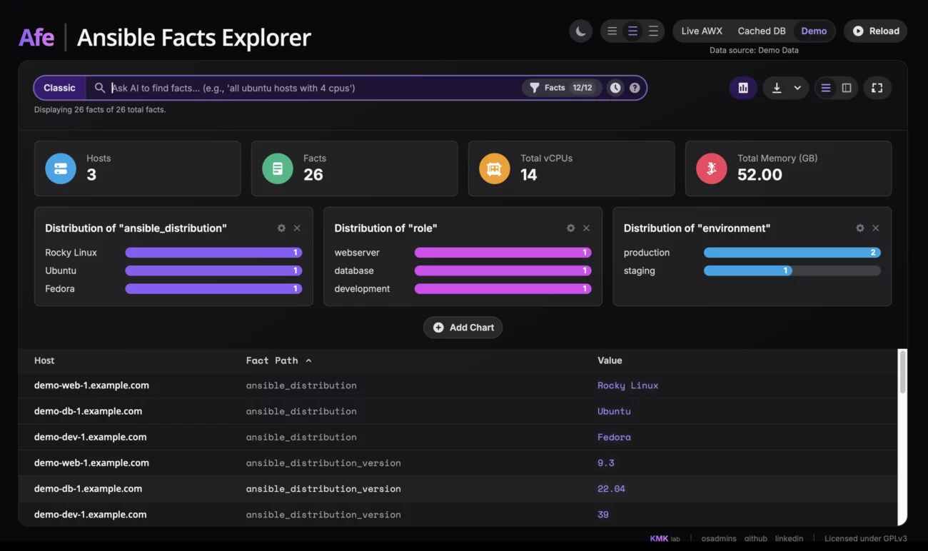
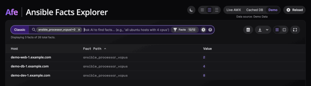
As for the interface itself, its main element is the search bar. In classic mode, it allows you to filter data using plain text, regular expressions, or key-value queries like vcpus > 4. Each such query can be added as a filter “pill,” combining multiple criteria to precisely find the information you’re looking for. Of course, there is also the aforementioned experimental AI feature, where you simply type what you are looking for.
Right next to the search bar, there is also the option to enable a dashboard that visualizes the facts and gives a quick overview of the entire infrastructure. It displays key metrics such as the total number of hosts, vCPus, or memory, as well as configurable bar charts where you can visualize the distribution of any fact, for example, the distribution of operating systems. After finding the data you’re interested in, you can display it in two ways: as a flat list of all facts or in the form of a pivot table. In the latter view, each row is a host, and the columns are specific facts, which makes it easier to compare configurations between machines. To avoid drowning in hundreds of columns, I added a panel where you can dynamically select only the facts that interest you, as well as enable a column with information about the date the data was collected, so you know how fresh the information is.
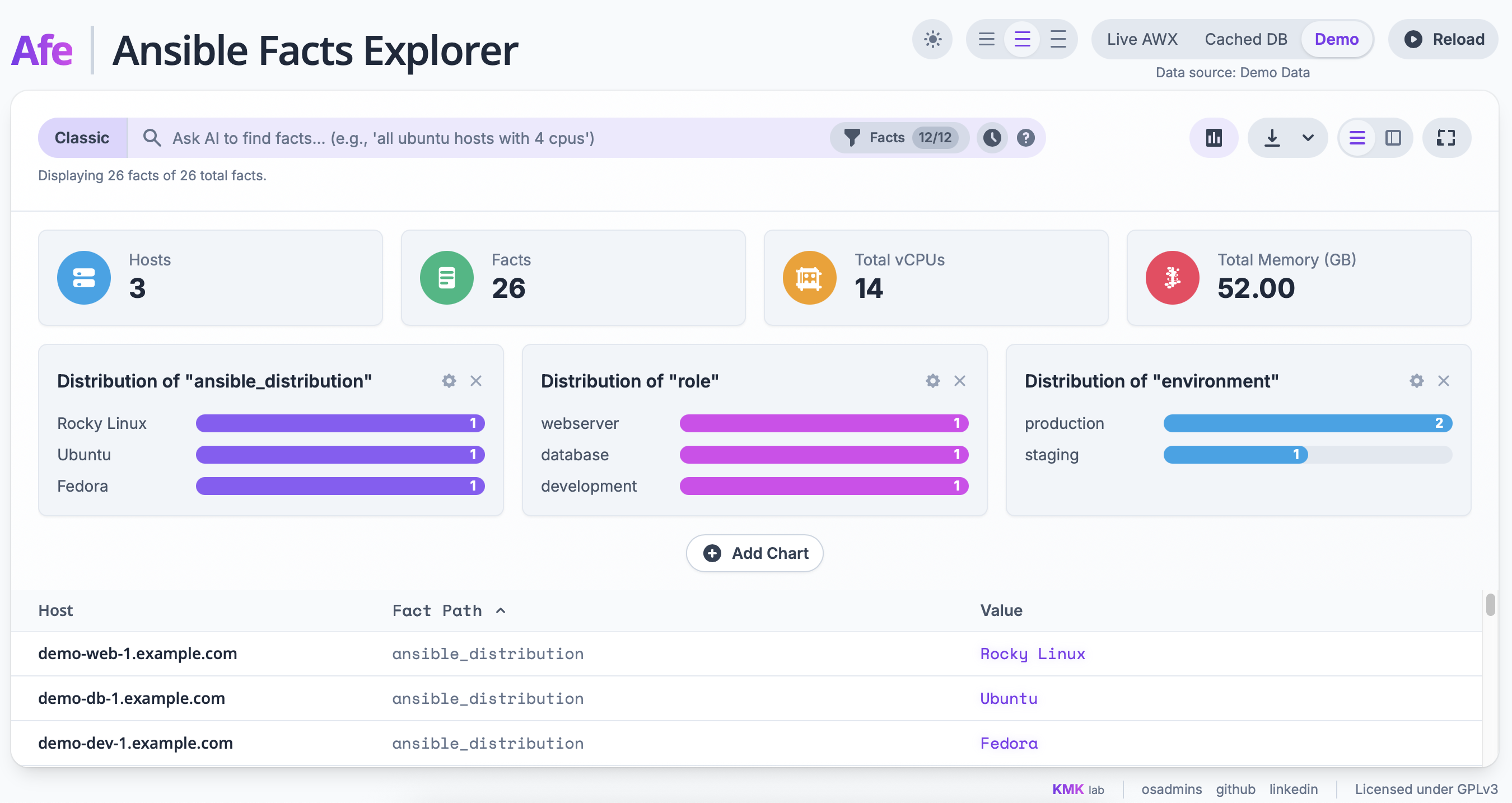
For user comfort, there is a light and dark theme, the ability to change table density, and a full-screen mode. Importantly, even with huge datasets, the interface remains smooth because I used table virtualization, which renders only the visible rows. Finally, any filtered view can be easily exported to a CSV or XLSX (Excel) file, and the export format adapts to the active view—either the list or the pivot table.
Important Note: This is Not a Production Tool
I must also point out that I have no idea how the application will behave in a large environment, and I strongly advise against using it in production. It was created and tested exclusively in a small lab. I do not know how secure the application’s build is, and due to the way it was created, it may contain bugs and vulnerabilities. I have also included an installer for Red Hat-based systems in the project, which automates the entire deployment process, but it has not been widely tested and may fail in some situations.
Check it out on GitHub!
If you’re curious about what was created, you can find the entire project, along with the code and installation instructions, on my GitHub: https://github.com/kmkamyk/Ansible-Facts-Explorer